
Orangetheory Case Study
Summary
This project aims to improve the Orangetheory Fitness app by enhancing coach transparency and feedback systems. Through user research and testing, it seeks to understand preferences, encourage meaningful reviews, and support informed class selection, ultimately boosting user satisfaction, attendance, and coach effectiveness.

Timeline
March 2025 — Present
My Role
UI / UX Designer
Platform
iOS & Android
When booking a coach feels like guesswork
In 2018, I joined Orangetheory and quickly fell in love with the structured workouts and community-driven atmosphere. But no matter how often I went, one thing always felt off there was no way to learn about or connect with coaches through the app.
At first, I thought I was being too particular. But after years of small conversations with fellow members, I realized I wasn’t alone. This wasn’t just a minor gap it was a missed opportunity to create a more personalized and motivating experience for users.
" I wish I could just filter by coach, read reviews or favorite the ones I like. "
The Problem: Lifting the veil on instructor transparency
Before the app enhancements, users like Annie faced several challenges:
Limited Information: Instructor expertise and teaching styles were unclear, making it hard to pick the right fit.
Inefficient Booking: Navigating multiple steps to choose a class was cumbersome.
Lack of Feedback Options: Users couldn’t leave meaningful reviews to help others or benefit from existing ones.
These gaps impacted users and deprived coaches of feedback to improve their teaching styles. My mission was clear, create features that empower users and coaches while enhancing engagement and trust.
The Solution: Empowering with features
Annie’s Story: Why the right coach makes all the difference
Meet Annie, a 35-year-old software engineer and mother of two. Like many Orangetheory Fitness users, Annie’s packed schedule left little room for trial and error when selecting the right coach. Annie needed quick access to trustworthy information about class formats, instructor expertise, and user reviews. Without these, she felt disconnected from her fitness goals. This is the story of how Annie’s experience and that of many others was transformed through design.
Why is it so hard for members like Annie to choose the right coach with confidence?
I chose a user interview as a user research method. I interviewed OrangeTheory users to uncover key pain points, such as the desire for transparency and simplified booking. The interviews aimed to explore user needs and challenges in selecting fitness instructors and booking classes through the OrangeTheory Fitness app. The goal was to gather insights on improving app features like instructor profiles, reviews, and booking processes.

I was looking for a way to review my coach so others could see it before booking—but there didn’t seem to be a place for that
If I can’t see whether a coach is certified, I start to second-guess booking the class


It would be super helpful to see reviews or feedback on coaches before booking. Right now, it’s just guesswork.
I’d definitely want the option to leave honest feedback even negative without attaching my name to it.


I’ve just started getting into a consistent workout routine, and I’m booking classes through the app
but I really wish I could learn more about the coaches before I choose
From these patterns, a few core insights emerged:
Need for Instructor Transparency: Users want detailed profiles with teaching styles and expertise to make informed decisions. Value of Reviews: Feedback and ratings are crucial, with a preference for anonymous and streamlined submissions.
Feature Gaps: Users highlighted missing profiles, class descriptions, and reminders, impacting their experience.
Convenience Matters: Busy users must-have favorites, quick bookings, and better navigation
Feedback Barriers: Privacy concerns and effort deter reviews; simple mechanisms are needed
Here’s how these insights shaped my next move:
Add instructor profiles and anonymous reviews.
Integrate favorites, reminders, and better class descriptions.
Address privacy concerns to boost feedback participation.
Walking in the User’s Shoes
Based on quantitative interview data, I created a Persona to represent OrangeTheory Fitness users, helping me understand their motivations, challenges, and goals. This Persona guided the feature design process, ensuring that additions like instructor profiles, reviews, and personalized recommendations addressed their needs and improved the overall user experience.

Annie represents a type of Orangetheory member who is consistent, driven, and values structure but doesn’t have time for trial and error. Her experience helped shape the foundation of this project by highlighting how disconnected the app can feel from the in-studio experience, especially when it comes to coaches.

As a busy professional and mom of two, I want to easily find and book classes with coaches
I trust, so I can stay consistent with my fitness goals without wasting time
Annie’s need for efficiency and personalization guided key design decisions—especially around improving coach visibility, enabling favorites, and adding meaningful reviews. Her story helped ground the project in real, everyday user frustrations and opened the door to a more human-centered fitness app experience.
Prioritizing the Right Problems to Solve
To define the product’s direction, I focused on a single, central problem rooted in my primary persona’s journey. This led to the following problem statement.
Users like Annie struggle to make informed booking decisions due to a lack of coach-specific information, inefficient navigation, and no ability to give or read feedback. These gaps not only hinder user confidence and engagement but also prevent coaches from receiving valuable insights to grow. The product needed to bridge this disconnect empowering both members and coaches through transparency, efficiency, and trust.
To define the product’s direction, I focused on a single, central problem rooted in my primary persona’s journey. This led to the following problem statement.
How might I design a solution that meets user needs, builds trust, and fits within the market landscape?
Learning from the Competition
Competitor analysis revealed gaps in how other fitness apps handled coach profiles and reviews.

Design Challenges & Rejected Ideas
During my redesign of the Orangetheory Fitness App, I explored various concepts to improve the user experience. However, not every idea aligned with user needs or added meaningful value. Through user research, testing, and competitor analysis, I refined certain design concepts while choosing to reject others. Below are the key design challenges I faced and the ideas I ultimately set aside:
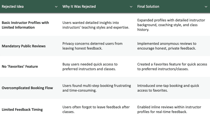
Rejecting these ideas taught me that user-centered design means making intentional, thoughtful decisions. Simplifying workflows, respecting user privacy, and personalizing the experience are essential for creating meaningful and engaging digital products. Prioritizing user feedback led to solutions that not only improved the app’s usability but also aligned with Orangetheory’s mission to empower users in their fitness journey.
Scope and structure
I limited the initial scope to the member-facing iOS experience within the Orangetheory app. My goal was to improve how users discover, connect with, and book classes with their preferred coaches without disrupting the flow or consistency of the current experience.
I aimed to make my designs feel realistic and feasible, meaning I considered edge cases, app structure, and how features like reviews, filters, and favorites might integrate into existing systems. Business goals like increasing engagement and retention were weighed alongside user needs for personalization and trust.
Users like Annie struggle to make informed booking decisions due to a lack of coach-specific information, inefficient navigation, and no ability to give or read feedback. These gaps not only hinder user confidence and engagement but also prevent coaches from receiving valuable insights to grow. The product needed to bridge this disconnect empowering both members and coaches through transparency, efficiency, and trust.
I started generating early ideas by asking:
How might we help members easily discover and book classes with coaches they trust—without making the app feel overwhelming or unfamiliar?
Mapping the Experience
The core user journey centered around creating and ordering a mix, this became the foundation of the primary flow. I began by mapping out a simplified version, identifying key decision points and outlining a clear happy path. This helped me start shaping how content and functionality would be structured within the app experience.

Wireframes
Lo-Fi Wireframe
I started with lo-fi wireframes to map out the core features of the OrangeTheory app update. My focus was on creating a clear flow for users to discover instructors, view profiles, and leave reviews. I included simple layouts for the coaches list, detailed instructor profiles, and a review submission form to test usability. I also added a favorites tab for quick access to preferred instructors. These wireframes helped me validate the functionality and navigation before moving to high-fidelity designs.

Time to Test
1. Streamlined Reviews: Users preferred inline review options directly on coach profiles with the ability to edit before posting.
2. Enhanced Navigation: Suggested adding a search function and integrating “Write Review” within profiles.
3. Improved Coach List: Recommended sorting by ratings, popularity, or proximity and highlighting favorites at the top.
4. Context Preservation: Favored pop-up windows for reviews to reduce navigation interruptions.
5. Coach Transparency: Users valued condensed schedules for favorites and visible submitted reviews.
Visual Design
User Reviews and Ratings
Ability to review instructors so that it helps the users can make an informed decision

Schedule Management
Schedule Management allows users to view class schedules, book sessions effortlessly, and plan their fitness routines with ease.

Adding Instructors to Favorites list
The Favorites Feature lets users save preferred instructors, enabling quick booking and seamless planning, especially on busy days.

Enhancing usability and showcasing Orangetheory’s brand through Visual Design
In redesigning the Orangetheory Fitness App, every visual design decision was made with the dual purpose of improving usability and strengthening the brand’s energetic and motivating identity. The design choices were intentional, combining functionality with the dynamic spirit of Orangetheory to create an engaging and seamless user experience.

Rejecting these ideas taught me that user-centered design means making intentional, thoughtful decisions. Simplifying workflows, respecting user privacy, and personalizing the experience are essential for creating meaningful and engaging digital products. Prioritizing user feedback led to solutions that not only improved the app’s usability but also aligned with Orangetheory’s mission to empower users in their fitness journey.
Iterations on Visual design
Iteration 1
In the first iteration, I focused on simplifying the class booking process to make it more efficient and user-friendly. I introduced a Favorites feature, allowing users to save their preferred instructors for quick access, which was particularly helpful for those with busy schedules. I also added sorting options for class schedules and implemented a one-tap booking system to minimize the steps required to reserve a session. These changes made it easier for users to organize their fitness routines and improved their overall experience.

Iteration 2
In the second iteration, I worked on improving the review and feedback process to encourage more participation and ensure meaningful insights. I added an edit option for reviews, giving users the flexibility to refine their feedback before submission, and introduced anonymous review submissions to address privacy concerns. To streamline the process further, I incorporated inline review prompts directly within instructor profiles. These enhancements made it easier and more comfortable for users to leave feedback, improved the quality of reviews, and built greater trust within the Orangetheory community.

Lessons Learned
Designing the MatchWatch app emphasized the importance of user-centered design and iterative feedback. Clear navigation, intuitive communication, and customization options like personalized notifications were critical to user satisfaction. Social engagement features proved essential for fostering community, while a unified platform reduced frustration by eliminating the need to switch between apps. The process highlighted the need for simplicity without sacrificing functionality, ensuring even complex features like highlight creation remain accessible. These lessons reinforced the value of testing, refining, and balancing user needs with functionality for a seamless experience.

Let's Collaborate
Let's talk about a project,
collaboration or an idea you may have
© 2024 Amulya Varma. Designed and built with Framer.
Amulya
Product Designer
Bay Area, California